OUR PROBLEM
"A cramped kitchen that was cut off from the house"
THE SOLUTION
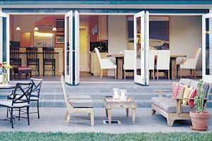
A flexible entertaining space that spills into a backyard
BEFORE
The original kitchen was not only small and plain, but was too far from the backyard to satisfy the Bibeau's vision of a roomy, flexible space.
AFTER
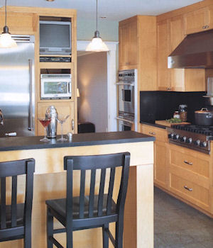
The new kitchen locates the principal cooking activities within a small footprint, allowing more area for dining and entertaining. The casual yet sophisticated breakfast bar visually separates the kitchen from the living area. 
The simple, modern kitchen that came with this bungalow when Norm Page and Jacqueline Bibeau bought it a few years ago had little to do with the charming style of the house or the way the couple saw themselves living in it. The fact is this couple had big dreams. Like most people, they wanted a new kitchen with a lot of function, but they couldn't spend a fortune to get it and had only the existing space of their first floor to work in. The couple longed for an indoor/outdoor space that would not only accommodate their love of cooking but also would let the kitchen communicate seamlessly with a new living/dining area and, even more importantly, with their large backyard, allowing them to entertain for business and for pleasure. 
After bumping into each other for nearly a year in the original space, the couple was ready to make those dreams come true. In their plan, the first thing to go would be the extra bedroom and bath at the back of the house that blocked the kitchen from the warm California sunshine just outside.
Getting rid of these would create more room and make possible a wall of glass doors that would open onto a spacious new patio.
Into this open space, they wanted to put a kitchen that could easily shift gears from quiet haven to work area to party mode, intimate enough for the two of them to enjoy when they were alone but big enough to handle a crowd. Since Jacqueline, who is a partner in a small ad agency, works at home, she also needed the kitchen to work occasionally as a businesslike gathering space for meetings that might overflow from her upstairs office.
They worked up a plan to turn the back half of their first floor into a friendly, multitasking space with San Francisco architect Michael Mullin. By simply demolishing a few walls, Mullin's design created a spare, open space with intimate charm and wide-open energy and did it within the couple's tight budget. Although the demolition required Norm and Jacqueline to move out of the house for three months, the results proved worthwhile. The new kitchen/dining area includes a large, open space spanning the back of the house with room for a small reading corner and designated dining area, all of which spill into the backyard through three wide pairs of glass doors.
A Hardworking Kitchen
The working heart of the kitchen is a well-laid out, well-equipped space with lots of gear, counters, and storage designed into a surprisingly small footprint. The kitchen has lots of clever storage ideas squeezed cleanly into out-of-the-way places, such as the small pantry closet that just fits under the stairs. It's also loaded with hardworking equipment such as the six-burner, pro-style cooktop, double wall ovens, a beefy refrigerator, a farm-style sink, and a professional-grade electric mixer. Typical of the thoughtful organization at work here, the mixer sits on a swing-up shelf that can be pulled out quickly or stowed invisibly back in its cabinet. In fact, all of this well-designed efficiency frees up the open spaces of the room to be simply, well, open.
The clean, custom maple cabinets are done in a spare Shaker style. Soapstone countertops and slate tile floors provide a warm, traditional nuance, while they create a contemporary-looking horizontal expanse of black stone to offset the light cabinets. Such vintage touches as an apron-front farm-style sink are accompanied by just enough stainless steel in the form of appliances, the vent hood, and the backsplash to keep the look up to date.
Defining Your Space
To get the little space they had to accomplish many things, Norm and Jacqueline intentionally left the boundaries within the kitchen, dining, and living space loosely defined. The only clear edge here is the breakfast bar that separates the kitchen's work area from the open space. This strategy allows each part of the room to borrow visual--and, if necessary, physical--space from all of the other parts. For example, the dining room, which sits at one end of the room, feels much larger because it shares visual space with the rest of the kitchen. Also, when it needs to be turned from dining space into a work area, that activity can easily expand into the adjoining space. None of these things would happen if the boundaries were too clearly defined.
The wide glass doors swing out to transform the kitchen and dining alcove into an open, welcoming, indoor/outdoor space, perfect for parties and enjoying the California sun.
Although the working part of the kitchen is relatively small, it now benefits from the increased space and sun exposure in the dining area.
Added Ingredients
indoor outdoor floors
Slate tile was used for the floor here for a variety of stylistic and functional reasons. First, it is weather resistant enough to use outside as well as in, allowing Mullin to create a continuous floor surface that covers the kitchen and dining area then moves outside onto the patio, with no interruption but a piece of weather stripping. Second, in the kitchen the slate picks up the black horizontal lines of the soapstone counters. Finally, it is an ideal transmitter of the radiant floor heating used here. But slate is a popular choice in any kitchen because its soft and porous texture feels warm and comfortable underfoot. This texture, though, means that it needs to be sealed on installation and resealed every year or so.
before & after
In the old plan, the prime real estate on the first floor was occupied by a bedroom and bath that the couple was happy to trade for a bigger and better kitchen. The remodeled plan includes the wall of glass doors the couple desired while delivering enough space to handle activities from breakfast to work to entertaining.
An Elegant Alcove
A breakfast bar separates the kitchen from the open space that includes an ample area for mingling, a small but elegant dining alcove, and even a place to sit and read. It also includes a counter fitted with additional upper and lower cabinets for storage, which, in effect, serves as an extension of the kitchen itself. The counter also has a small sink and two wine chillers--one for white and one for red--so that it easily turns into a bar when the occasion arises. The dining alcove at the far end of the open area is furnished with an intimate dining table and eight upholstered chairs.
Along the back of the house, the glass doors open onto a terrace that is built to the same level as the kitchen floor and uses the same slate tiles, so that on warm evenings, of which there are many in this part of the world, the life of the kitchen flows easily in and out without interruption.
The kitchen was designed with a six-burner cooktop and a pair of wall ovens close together with counter space in between to keep the cooking activity all within one area.
The wall of glass bricks above the counters lets in sunshine but maintains the couple's privacy.
To add storage to the new kitchen, this shallow pantry closet was created along a wall of the back hall, making good use of otherwise wasted space.
Upclose
Although no larger than the old kitchen, the working space of the new kitchen is filled with features that pump up its usability.
Pantry closet
In the recess under the stairway, Mullin carved out a pair of storage cabinets with shelves that pull out for easy access.
Pull-out shelves
Pull-out drawer shelves make the small storage cabinet beneath the microwave easy to use.
Integrated shelves
The stainless-steel backsplash between the cooktop and vent hood features integrated shelves to keep spices and utensils handy.
Oversized pot drawers
Beneath the cooktop, two large pot drawers offer easy storage for bulky cooking equipment.
Storage Strategies
Making the most of your existing storage options while coming up with creative new ones may ultimately keep your remodeling costs down by minimizing the amount of cabinetry you will have to buy. It will also increase your enjoyment of your finished kitchen by making everything easy to find.
Base Cabinets
Easy ways to maximize the storage you have available in your base cabinets include:
Pull-out shelves. Base cabinets with doors and open shelves are the least expensive configuration. By adding pull-out shelves on rollers, you will make the items stored at the back easier to get to.
Drawers. Drawers are the most efficient way to store equipment that you want to reach in a hurry but are more expensive than cabinets with doors. Use deep storage drawers for big pots and pans or other bulky items.
Corner storage. To ensure that the deep corner spaces where base cabinets meet don't turn into dead space, add a lazy Susan-style carousel or one of the new high-tech, double-tiered, wire rack systems.
Appliance shelves. A lift-up shelf that pops in and out of a base cabinet is a great way to store a heavy appliance, such as an electric mixer or food processor.
Pantries
A good-sized and well-situated pantry can provide an easy and inexpensive way to store lots of canned and dry food plus extra cooking gear that would otherwise require expensive cabinets. You don't need a big, old-fashioned butler's pantry; instead, consider putting shelves in an old broom closet or infrequently used coat closet, install shelving under a stairway or in an odd nook, or close off an inconvenient passageway.
Display Storage
Open shelving on a wall, in an island, or under a counter is an attractive and inexpensive way to store things you want to show off, such as fine china, glassware, or cookbooks.
Deep Storage
Create storage spaces for infrequently used items wherever you can by using benches (add a hinged lid) and out-of-the-way shelves (like above the refrigerator) to keep things you don't need often.
Finding creative ways to make new storage options is a great way to keep costs down. Using the dead space within this bench for storage is like getting a free extra cabinet.
Pop-up storage shelves save precious counter space by making it easy to store often-used appliances out of the way yet easy to retrieve.
Large-capacity deep drawers are essential for bulky objects like cooking pots or metal bowls but are not recommended for breakable ware.
Open shelves with pretty objects you want to show off, like pottery or glassware, or with attractive baskets are a great way to save a little money on cabinet construction while adding charm.


